Image Point Formation
Another Way To Understand Lens Performance

The intent of this blog is to bring a fresh perspective to comprehending photographic lens performance for digital SLR cameras. As an amateur photographer considering the purchase of a new lens, perhaps my interests are yours: how sharp will the picture be with this new lens? And maybe your reaction to the well-meaning technical discussions on respected websites leaves you the same way it leaves me: huh? MTF, lateral chromatic aberration, soft, and crisp. Great if you're an optical engineer. But do you really know what performance you're buying? In actuality, most reviews only serve to make you feel comfortable liberating your cash. I've seen comments on several websites stating that such and such a lens is really sharp, when in reality, if you understood the manufacturer's technical specifications, you'd conclude people are purchasing marketing, not perfection.
I think there is a much easier way to understand photographic lens performance. And the idea is this: how well do lenses form an image of a point of light at all positions of the picture? An image is a collection of points, so my assertion is that examining a few selected points will be more useful to us mere mortals than specifying the tangential and saggital MTF at 10 lp/mm and 30 lp/mm across the image field.
OK, so how do we measure the image point performance of a lens? Easy: encircled energy. This metric is very easy to comprehend once you understand how a perfect lens makes perfect points of light. Encircled energy highlights the lens performance itself, decoupling the influence of sensor pixel shape and size on image quality. Also, reporting lens performance this way facilitates comparison between competing models in an intuitive way.
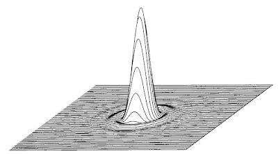
A perfectly focused point of light is not infinitely small, but has a structure with a bright central core and surrounding rings of diminishing strength. That structure is very famous in optics and is called the Airy disk. That bright central core has a finite width and if you draw a circle around this core (encircle,) you will find the perfect point contains 83.8% of the total energy. An aberrated lens changes the Airy disk by pulling energy out of the central core and distributing it further out towards the rings. And usually not in pretty, symmetric ways. In these cases, you must draw a circle of larger radius to encircle 83.8% of the aberrated image point energy. The larger this circle, the less perfect, or less sharp the lens becomes.

OK, so how do we report the image point performance of a lens? Easy: plot the ratio of the radii of the circles encircling 83.8% of the light for a perfect point by the aberrated point. A value of 1.0 is perfection. Ratios lower than 1.0 indicate the lens is not as sharp. A lens with values between 0.8 and 1.0 would be a very nice lens.
If you've come this far, you'll want to click here for a lens performance assessment using encircled energy.
So stay tuned. We intend to reveal the performance of some current photographic lens offerings in this fashion. AF-X DX Nikkor 18-200mm f/3.5-5.6G ED VRII lookout!